
When Desktop-Only Workflows Need to Travel
Yahoo!'s DSP lets advertisers create, manage, and track campaigns, but it was built entirely for desktop. The objective: translate those complex advertising functions into an intuitive mobile interface, built natively for iOS and Android.
My Role: Senior UX Designer
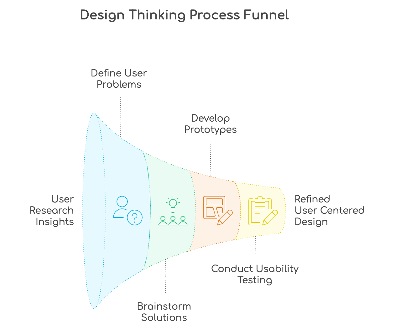
Think → Make → Check
Interviews · Surveys · Contextual Observation
Conducted interviews, surveys, and direct observations to understand advertiser workflows, pain points, and mobile expectations, all before designing a single screen.
Research synthesis: advertiser workflows & pain points

Early wireframe sketches from empathy sessions
- Complex campaign setups with no mobile-adapted flow
- Inconsistent UI appearance across mobile surfaces
- Scalability struggles as features expanded without mobile guidance
- Inadequate data visualization for on-the-go decision making
Personas · Journey Maps · Problem Statement
Built personas and journey maps to sharpen the problem. They surfaced that complex campaign setups and inadequate data visualization were the core barriers to mobile adoption.
Brainstorming · Cross-functional Collaboration · Platform Guidelines
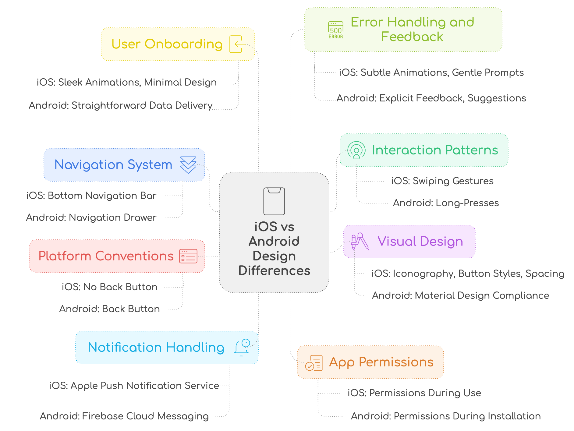
Facilitated brainstorming sessions with designers, developers, and PMs, focusing on platform-specific guidelines (Human Interface for iOS, Material Design for Android) to shape genuinely native solutions.
Cross-functional ideation: iOS vs Android design principles

Platform-specific interaction patterns exploration
Low-Fidelity → High-Fidelity · iOS + Android
Progressed from lo-fi wireframes to high-fidelity prototypes, tailored separately for iOS (Human Interface Guidelines) and Android (Material Design) to honor each platform's native conventions.
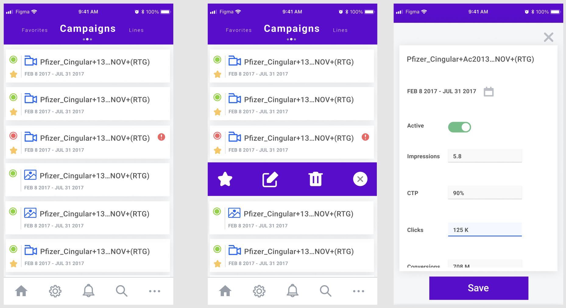
Lo-Fidelity Wireframes
iOS lo-fidelity wireframes: navigation & campaign flows
Android lo-fidelity wireframes: material design structure
Hi-Fidelity Prototypes
iOS hi-fidelity prototype: final interaction design
Android hi-fidelity prototype: material design system
iOS Human Interface Guidelines
Android Material Design
Usability Sessions · Both Platforms · Iterative Refinement
Ran structured usability sessions on both iOS and Android, iterating on navigation clarity, accessibility, and visual consistency until the experience felt effortless on each platform.
- Navigation patterns refined for thumb-reach and one-handed use
- Accessibility validated across both platforms for contrast and tap target size
- Visual consistency confirmed without compromising platform-native feel
- Campaign management flows simplified to reduce steps and cognitive load
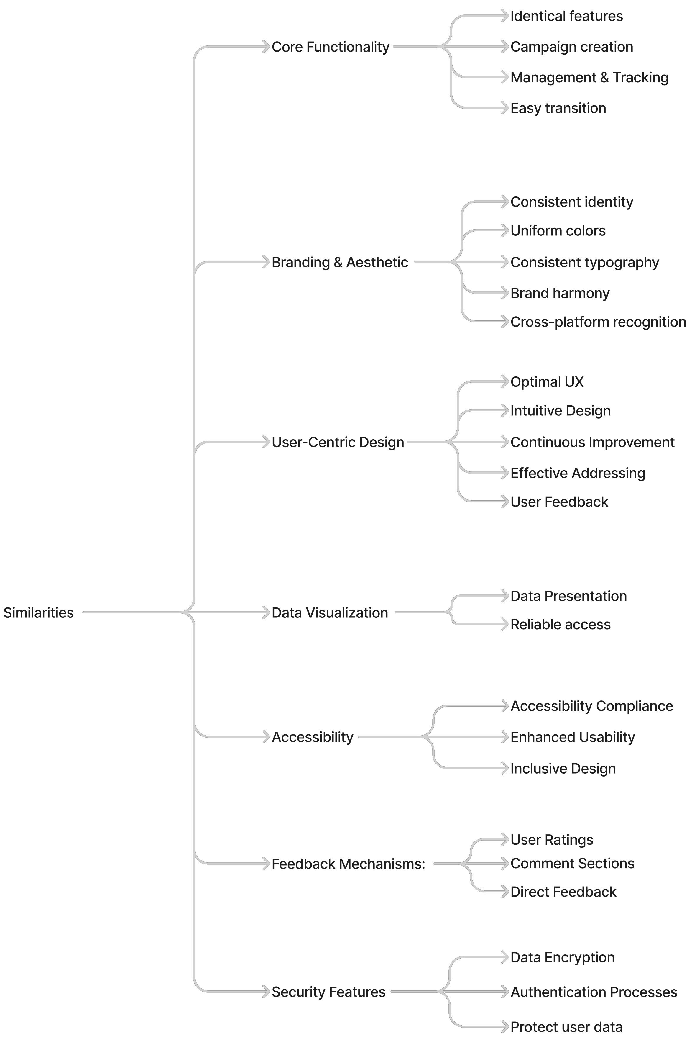
Similarities & Differences
What Both Platforms Share
Where They Differ
Success Metrics & Measurement
Want to see the full process? Wireframe progressions, usability findings, or platform-specific decisions: connect on LinkedIn.
Calls I Made on This Project
Separate iOS and Android interaction models
The team default was a single unified pattern designed once and adapted to both platforms. I argued against it. iOS and Android users have deeply ingrained platform conventions - navigation patterns, gesture models, feedback mechanics - and designing against those conventions creates subtle friction that users can't name but definitely feel. I designed platform-specific interaction models for the core flows, added 2 weeks to the schedule, and the post-launch satisfaction scores validated the tradeoff: iOS users reported significantly higher comfort with the app.
The "view-only" mobile scope
Product initially scoped mobile as a monitoring-only experience - see campaign performance, take no action. It was the safe scope. Session data from our analytics told a different story: advertisers were checking campaigns on mobile precisely when something needed adjusting - at events, during meetings, in transit. "View-only" in those moments meant they'd have to remember to act later, which often meant they didn't act at all. I brought the data to the product review and argued for a Quick Edit capability. It shipped. It became the most-used feature on mobile.
Full budget reallocation flow
We prototyped a multi-step budget reallocation flow on mobile - moving spend from underperforming campaigns to stronger ones in a single interaction. In testing it was a UX disaster: the interaction required too many precision taps, the stakes were high enough that users second-guessed every step, and the mental model of "reallocating budget" didn't map cleanly to a small screen. We cut the full flow and replaced it with single-field Max Bid editing with a clear impact preview. Smaller scope, dramatically higher confidence, zero rollback requests post-launch.
What Advertisers Said
Collected after 90 days post-launch via structured advertiser surveys and in-app feedback panels.
"I used to wait until I was back at my desk to check campaigns. Now I check pacing every morning before my first meeting. It's completely changed how I manage budgets."
"The notifications are a game changer. I got an alert that a campaign was underpacing, approved a budget adjustment from my phone, and saved the flight. All in under 5 minutes."
"Finally a DSP that actually works on mobile. The Android version feels native. It doesn't feel like a desktop site crammed into a phone. My team uses it every day."
"The dashboard health indicators are brilliant. I see at a glance which campaigns need attention without digging through tables. It's exactly what mobile should feel like."
"I approved three campaign changes from an airport lounge last week. That would have been impossible before. This app gave me back hours I used to spend waiting to get to a computer."
"The filter experience on iOS is really well thought out. It's not just a port of the desktop. You can feel that someone actually designed it for a thumb, not a mouse."