

Project Overview
Yahoo!'s Ads Platform is a Demand-Side Platform (DSP), a sophisticated control center where marketers plan, purchase, and optimize ad placements across the web. At the core of daily advertiser workflows sits the data table: a dense, complex grid that advertisers live inside for hours each day.
The "Yahoo! Ads Tables" project was a 14-month initiative to fundamentally transform how advertisers interact with campaign data, reducing cognitive load, surfacing actionable insights faster, and empowering decision-making at scale.
Understanding the Job Advertisers Were Trying to Do
Jobs-to-be-Done research begins not with user personas, but with situations - the specific context in which someone reaches for a tool and what they're trying to accomplish. I ran 18 contextual interviews and two weeks of diary studies with Yahoo! DSP account managers, not to understand who they were, but to understand what they were hiring the Ads Table to do.
The answer that emerged was clear: advertisers were hiring the table to optimize live campaigns efficiently. But the table kept "firing" them - surfacing so much friction that the job couldn't get done in context.
Senior Account Strategist, Yahoo! DSP
Campaign Manager, Yahoo! DSP
Research Methods Used:

The Three Jobs This Table Had to Do
JTBD analysis separates the functional job (what users are doing), the emotional job (how they want to feel while doing it), and the social job (how they want to be perceived). Across all 18 interviews, three core functional jobs emerged with near-universal consistency:
When I'm reviewing campaign performance at the start of my day, I want to see budget pacing and health at a glance, so I can catch problems before they become missed goals.
When a campaign is underpacing or bidding too aggressively, I want to update bids and budgets without losing my place, so I can act on the signal immediately, not after a 5-click detour.
When I'm managing 40+ campaigns, I want to filter to exactly the right set in under 5 seconds, so I can spend my time optimizing, not searching.
The second step in JTBD analysis is identifying where the job breaks down - not "pain points" in the abstract, but the specific moments of friction that prevent job completion. Five barriers emerged:
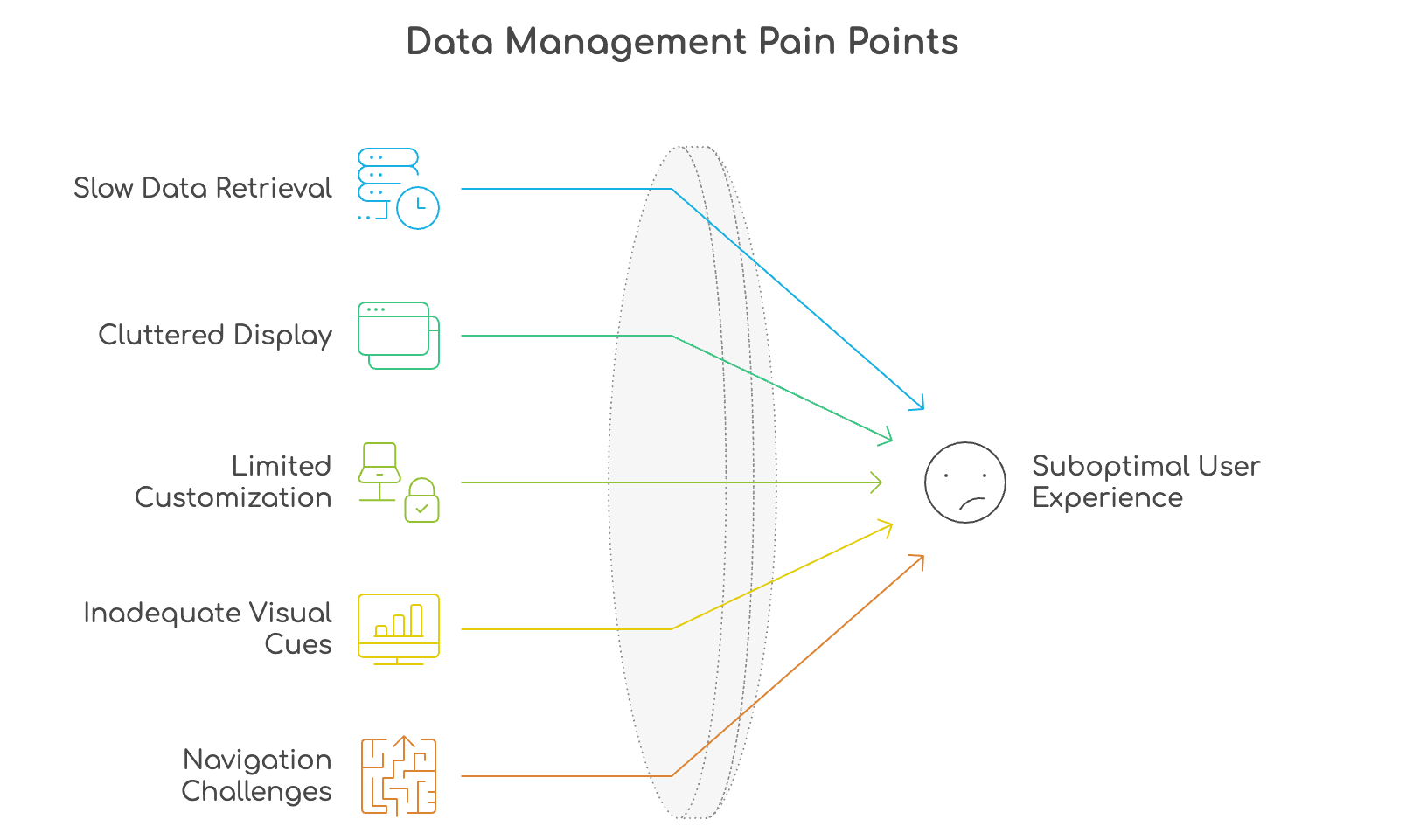
- Slow data retrieval: 8–12 second filter waits interrupted the "Find" job before it started. Users lost their mental query by the time results appeared.
- Cluttered information display: No hierarchy, no progressive disclosure - everything at once, nothing prioritized. The "Monitor" job required scanning 20+ columns to get one answer.
- No in-context editing: The "Adjust" job required a 5-click detour out of the table and back. Every adjustment broke flow.
- Zero pacing visibility: The "Monitor" job had no visual signal for budget health. Advertisers had to calculate pacing manually from raw numbers.
- Limited filter logic: Binary filters couldn't handle multi-condition queries, making the "Find" job impossible for complex campaign portfolios.
Mapping Solutions to Jobs - Not Features to Requests
In JTBD, the solution phase is anchored to a specific question: which solution closes which job gap? Rather than generating features from stakeholder wishlists, I ran 3 ideation sprints using an Impact–Effort Matrix with job completion rate as the primary impact axis. Every concept had to be traceable back to a specific job barrier before it qualified for prototyping.
Alongside job-fit analysis, UX laws grounded every interface decision:
- Law of Proximity: Grouped related controls and data together - edit actions surface only when a cell is in focus, not permanently cluttering the row.
- Hick's Law: Reduced visible choices at any given moment to lower cognitive load - the Right Rail surfaces detail on demand, not by default.
- Fitts's Law: Critical action targets (filter button, edit trigger, pacing toggle) made large and predictably placed for fast, accurate interaction.
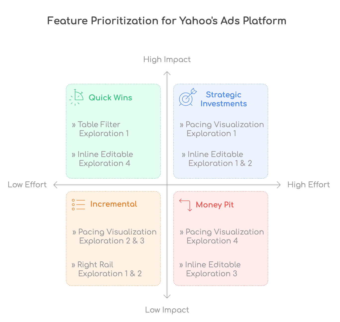
Four Solutions Built Around the Jobs
Each solution went through multiple rounds of low-fidelity wireframing, high-fidelity Figma prototyping, and iterative usability testing with real DSP advertisers. Every round was evaluated against the same question: does this help them complete the job faster and with more confidence than before?
1. Table Filter: Smarter Search, Fewer Clicks
- Multi-condition filtering: Advertisers can now combine filters (campaign status + spend threshold + date range) in a single, persistent filter drawer.
- Saved filter sets: Frequently used filters save automatically, reducing setup time for recurring workflows.
- Real-time result preview: Filter results update progressively as conditions are added, not just on submission.
Demo:
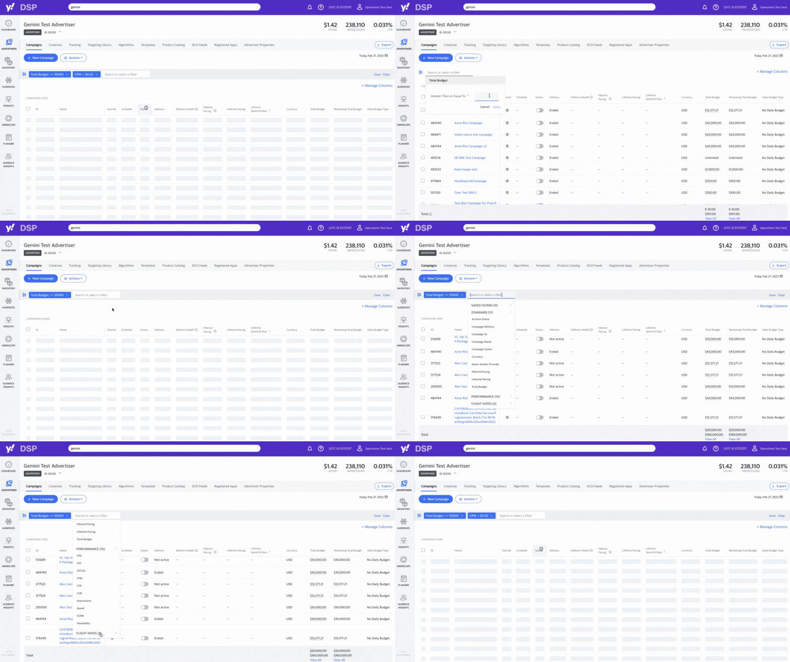
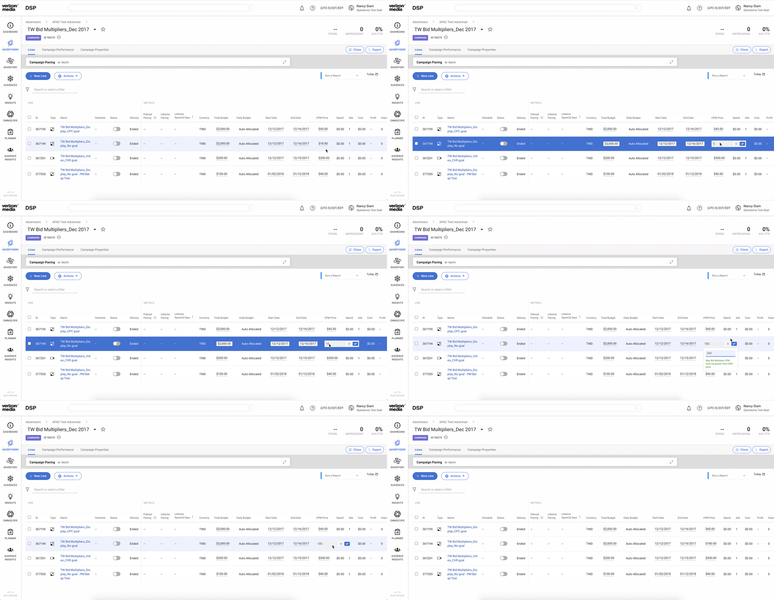
2. Inline Editable Cell: Edit Without Leaving the Table
- Direct in-grid editing: Click any editable cell (bid, budget, name) and edit it immediately, no page navigation required.
- Visual differentiation: Editable fields have a subtle highlight; non-editable fields are visually muted, zero ambiguity.
- Validation with guidance: Invalid values trigger inline error messages with specific corrective guidance, not generic alerts.
Demo:
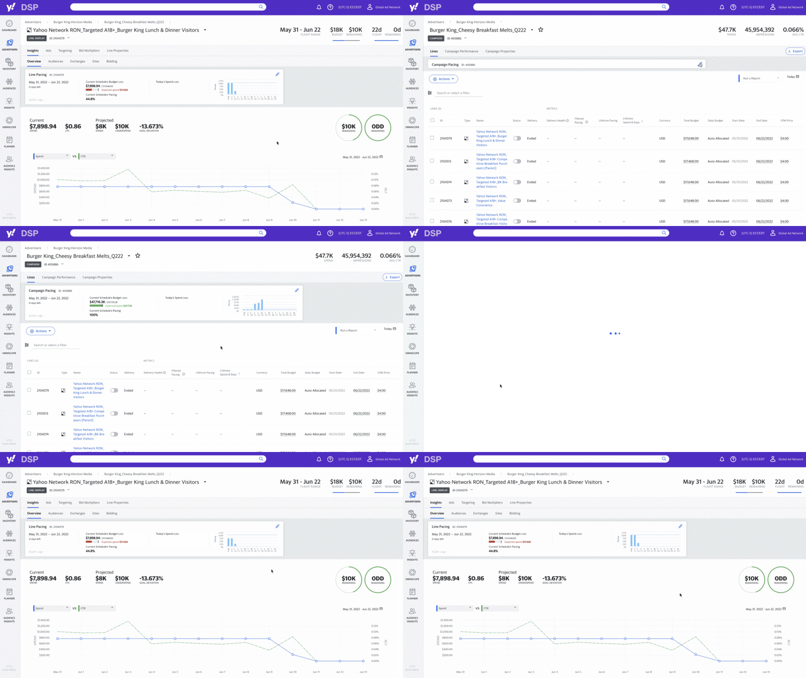
3. Pacing Visualization: See Your Budget at a Glance
- Visual pacing bars: Each campaign row now shows a micro-visualization of spend vs. projected pacing, color-coded by health.
- Historical overlay: Expand any row to see historical pacing trends without leaving the table view.
- Multi-schedule editing: Edit multiple campaign schedules directly from the pacing overlay without navigating away.
Demo:
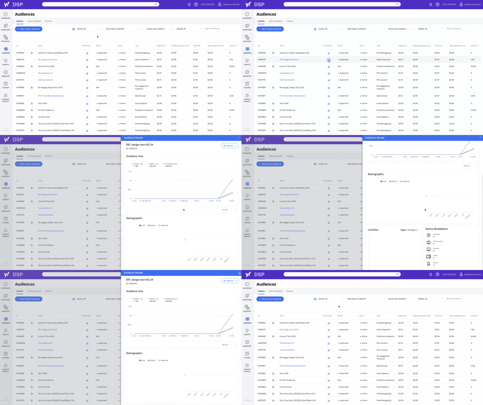
4. Right Rail: Contextual Data Without Context-Switching
- Slide-in detail panel: Selecting any row opens a Right Rail with performance charts, creative previews, and quick actions.
- Zero navigation required: All critical data surfaces in context, eliminating the need to open a separate campaign page.
- Expandable data modules: Users can customize which data modules appear in their Rail, respecting individual workflows.
Demo:
Did Advertisers Get the Job Done?
In JTBD, success is measured as job completion rate improvement - not just usage metrics. We rolled out features in phased A/B releases with 22 Yahoo! DSP advertisers, tracking whether each solution actually closed the job gap it was designed for.
The results were validated through Google Analytics, Tableau dashboards, and UsabilityHub satisfaction surveys. The table redesign became a benchmark for data interaction across Yahoo!'s product suite.
Account Manager, post-launch feedback
Calls I Made on This Project
Inline editing over a modal workflow
Engineering strongly preferred a modal dialog for bid editing - simpler to build, less state to manage. I held out for inline editing because research was unambiguous: every context switch out of the table added cognitive overhead and broke the user's flow. The technical complexity was higher. The user experience was meaningfully better. I made the tradeoff explicit in the brief and owned the outcome.
Adding more data columns "for power users"
The product brief called for an expanded column set - giving power users access to more data signals at once. I pushed back on this after seeing the research: the table was already over-dense, and more columns would compound the scanning problem we were trying to solve. More data isn't power if you can't find what you're looking for. I defended a reduction-first approach and we removed 6 rarely-used columns before adding a single new one.
AI-powered predictive sort
We prototyped a "smart sort" that would auto-reorder campaigns based on predicted performance risk - surfacing at-risk items before the user had to go looking. In testing, users found it disorienting: their mental model of the table depended on predictable ordering, and a system that moved things around felt unreliable rather than helpful. Good feature concept, wrong context. We cut it and shipped a manual sort with saved sort presets instead.
What This Project Taught Me
The Yahoo! Ads Tables project is a reminder that the most impactful design work often isn't about adding features. It's about understanding how people actually work and removing everything that gets in their way.
By anchoring every decision in a specific job story - not a user persona, not a stakeholder request - we made every tradeoff traceable. When engineering asked why inline editing was worth the complexity, the answer wasn't "users prefer it." It was: "this is the only way to close the Adjust job gap without a context switch." JTBD gave us a shared language for making hard calls with confidence.
Want to go deeper on this case study? Connect on LinkedIn/Nancy-UX for the full design documentation including wireframe progression, usability session recordings, and team feedback synthesis.
In Their Own Words
Collected from structured post-launch surveys and follow-up sessions with Yahoo! DSP account managers, 90 days after release.
"The filter alone saves me 20 minutes every single day. That's time I'm actually spending optimizing instead of searching."
single day
"Finally, I can update bids without leaving the table. It sounds small but it's actually massive. We cut campaign update time in half."
updates
"The pacing bars changed how I monitor budgets. I catch underpacing before it becomes a missed goal. My performance has visibly improved this quarter."
post-launch