Yahoo! Ads Rebranding
The Yahoo! Ads brand had been living on borrowed time. The original blue had been chosen in a different era, for a different competitive landscape. The advertising industry had evolved. Brands had become more sophisticated, competitors had modernized, and Yahoo! Ads was starting to look its age. I led the full rebrand of Yahoo! Ads, from initial audit through final style direction and implementation.
Process
The rebrand followed a rigorous research-driven process, not a gut-driven "we need to look fresh" exercise:
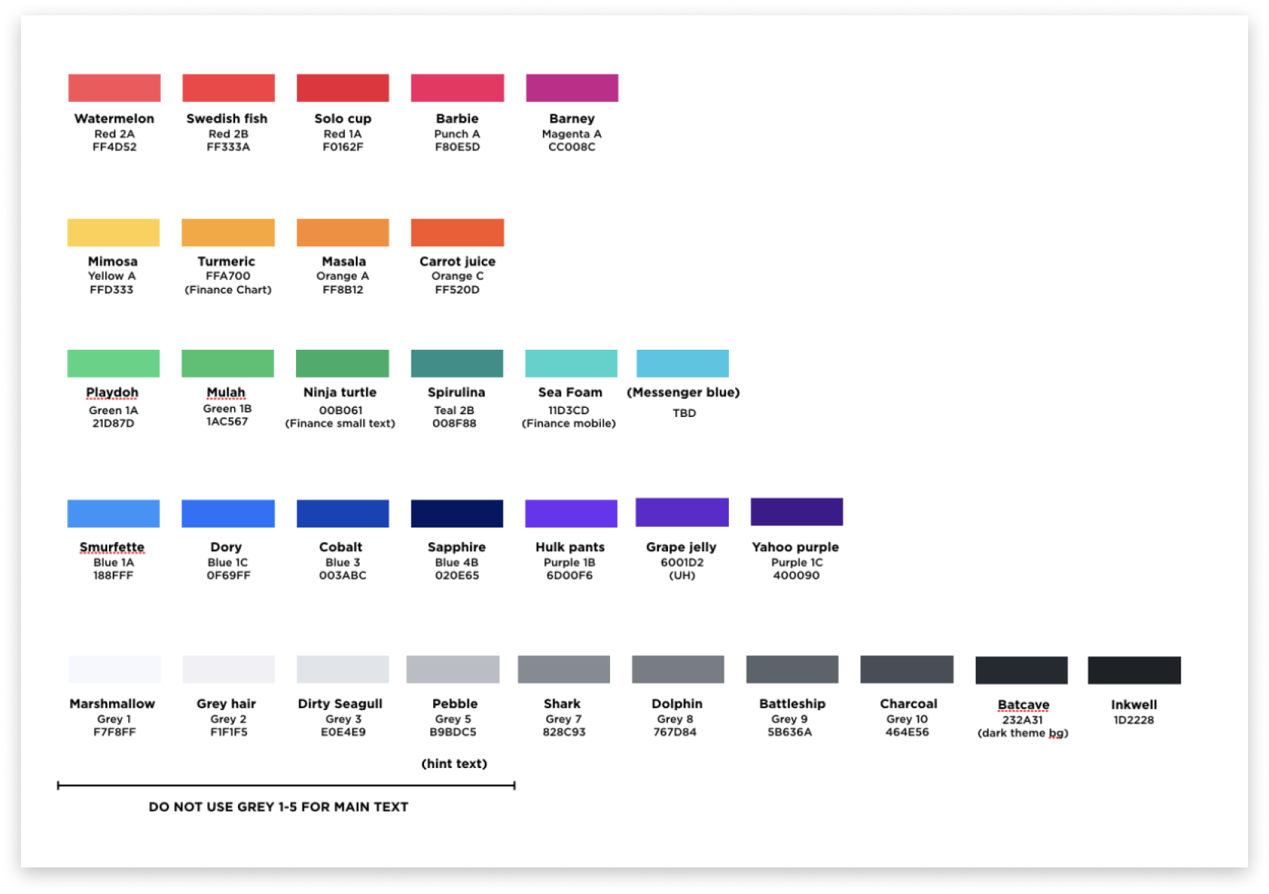
- Brand audit: Documented all existing brand touchpoints: product UI, marketing materials, presentations, documentation. Found 14 different shades of "Yahoo! blue" in use across surfaces.
- Competitive analysis: Benchmarked the visual identity of 8 major DSP and ad-tech competitors, identifying emerging design directions and areas of differentiation.
- Stakeholder interviews: Ran structured interviews with sales, marketing, and product leadership to understand how Yahoo! Ads was perceived internally and where the brand needed to go.
- Style direction exploration: Developed and pressure-tested three distinct direction boards with internal and external audiences before committing.

Brand direction exploration: final direction

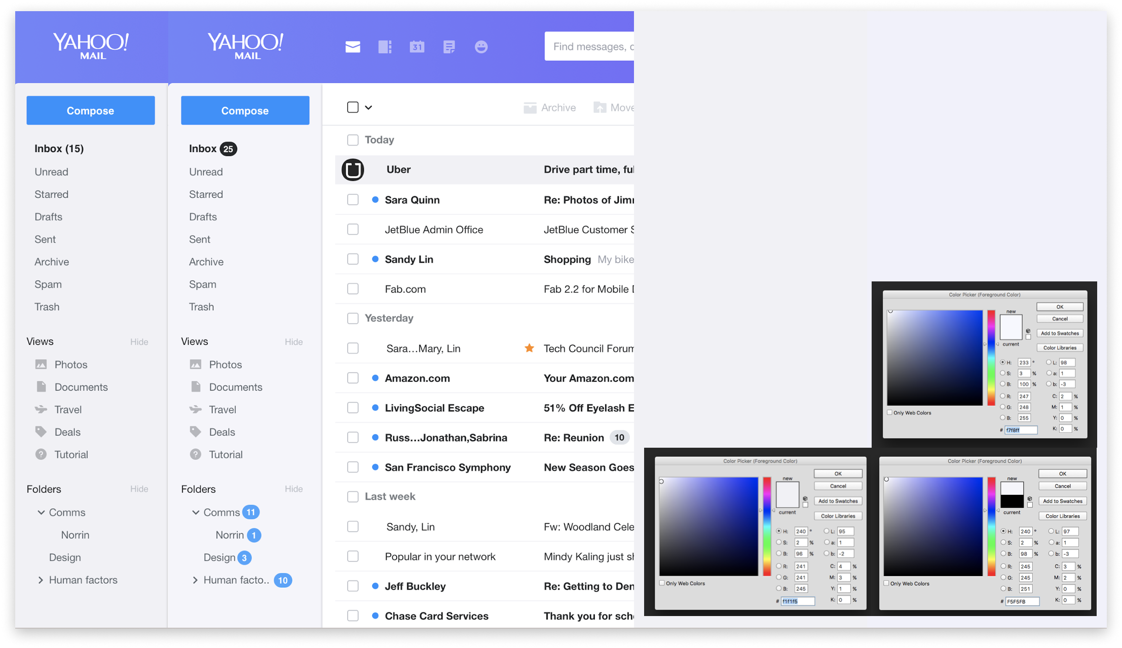
Before/after: Yahoo! Ads brand evolution
- 22% increase in brand recognition in post-launch advertiser survey
- Modernized, unified visual identity adopted across product UI, marketing, and sales materials
- 14 legacy color variants consolidated into a single, token-based color system
- Rebrand shipped across all Yahoo! Ads surfaces within a single release cycle
UI System Unification
The rebrand created the opportunity to fix something the platform desperately needed: eliminating the visual fragmentation that had accumulated across Yahoo! Ads surfaces over years of independent team shipping. I ran a parallel UI audit, cataloging over 200 inconsistencies across 6 surfaces, and used the brand migration as the forcing function to implement canonical component standards platform-wide - one rollout, two outcomes.
- Cross-surface audit: Catalogued every instance of 12 core component types - buttons, tables, modals, filters, inputs, and more - across all Yahoo! Ads surfaces. 200+ inconsistencies documented, prioritized, and resolved.
- Canonical component system: Defined the single authoritative version of each component, selected for accessibility quality, usage prevalence, and alignment with the new brand direction.
- Cross-team design review: Established a weekly design review that gave teams a forum to flag new patterns before shipping - a practice that became permanent after the rebrand shipped.
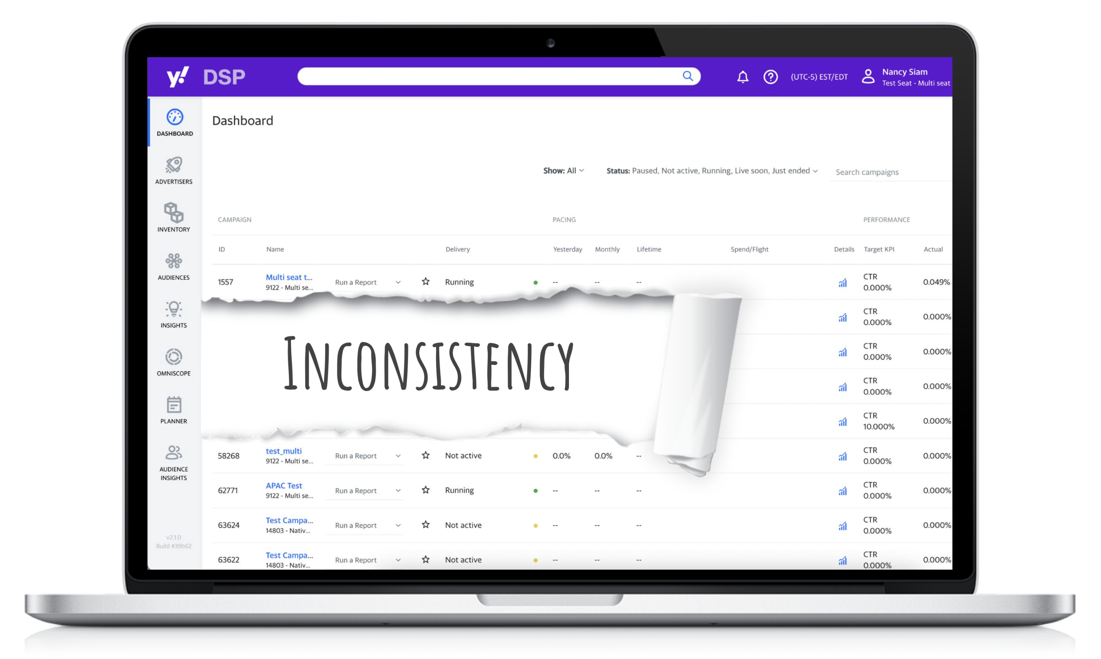
Cross-surface inconsistency audit overview
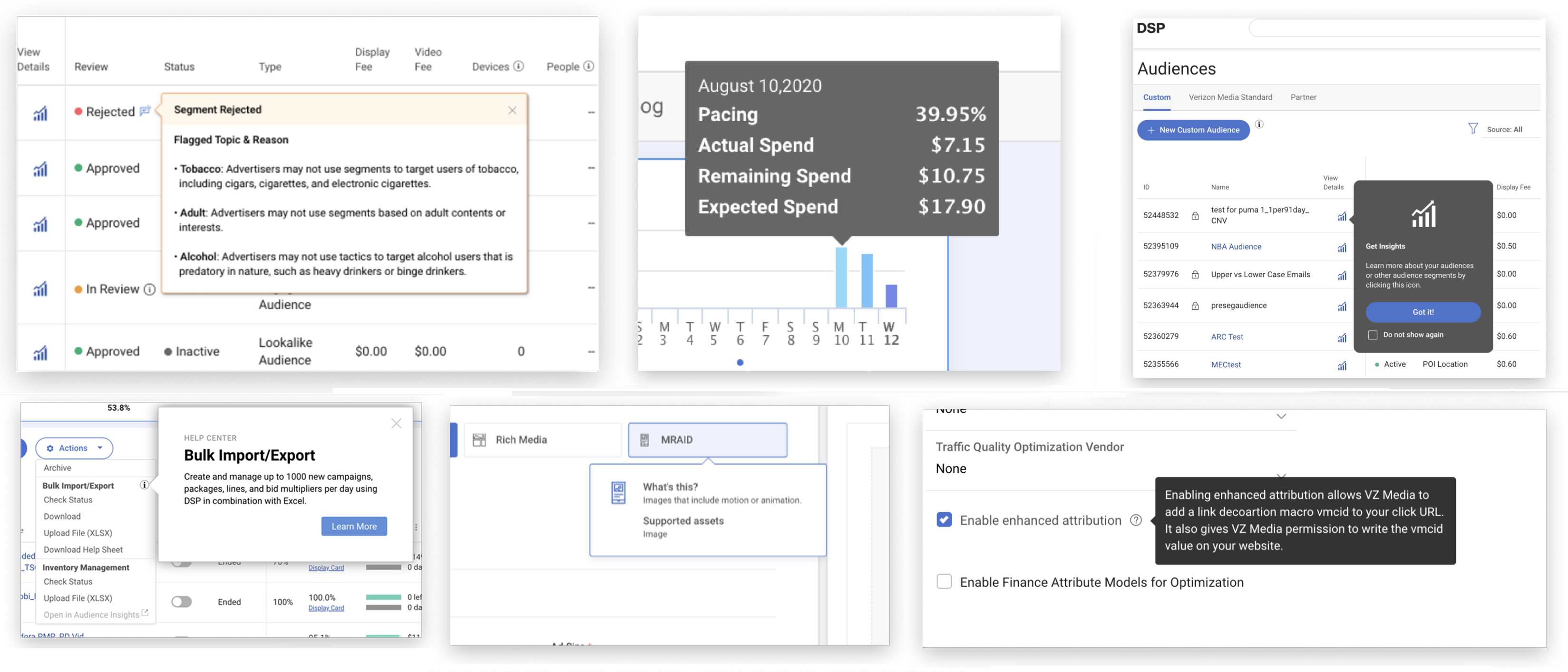
Component variation examples before unification
Watch the Award Presentation
The Yahoo! Bravo Award was presented to Nancy for brand leadership on the Yahoo! Ads Rebranding project.
Yahoo! BiDi Language Support
Bi-directional (BiDi) language support, the ability for a product to render correctly in both left-to-right (LTR) and right-to-left (RTL) scripts, is one of the most systematically underinvested areas in product design. Arabic and Hebrew together represent hundreds of millions of users. At Yahoo!, the RTL experience across portals was inconsistent at best and broken at worst.
I led Yahoo!'s Center of Excellence for BiDi design, establishing the design standards, tooling, and process for RTL support across 7 Yahoo! portals, and building the internal expertise that made sustained RTL quality possible.
Challenge
- RTL rendering inconsistent across 7 Yahoo! portals: some mirrored correctly, others partially, others not at all
- No centralized RTL design standards; each team handling RTL independently, producing divergent results
- Translation overhead was high: manual processes, inconsistent handoffs, and rework cycles consumed significant engineering and localization time
- Component library had no RTL specifications; components were designed LTR-only
- BiDi expertise was siloed in one or two engineers; no design-side knowledge base existed
What I Built
- RTL Design Standards: Authored the Yahoo! RTL Design Standards: a comprehensive guide covering layout mirroring rules, typography behavior, icon directionality conventions, number and date formatting, and animation direction.
- Component RTL specifications: Added RTL specifications to every component in the Yahoo! design system, including mirrored layouts, directional icon variants, and text alignment rules for each component.
- Localization automation tools: Worked with engineering to develop tooling that automated significant portions of the LTR-to-RTL translation process, reducing the manual overhead that had been a bottleneck.
- BiDi Center of Excellence: Established a cross-functional community of practice for BiDi design, running monthly workshops and maintaining a shared knowledge base that grew to 80+ documented patterns.
- 7 Portal rollout: Coordinated and QA'd the RTL implementation rollout across Yahoo! Mail, Yahoo! News, Yahoo! Finance, Yahoo! Sports, Yahoo! Lifestyle, Yahoo! Weather, and Yahoo! Homepage.
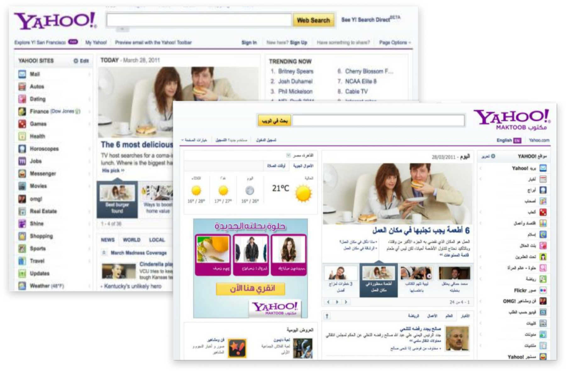
BiDi design standards: LTR/RTL layout principles

Component RTL specifications: navigation mirroring
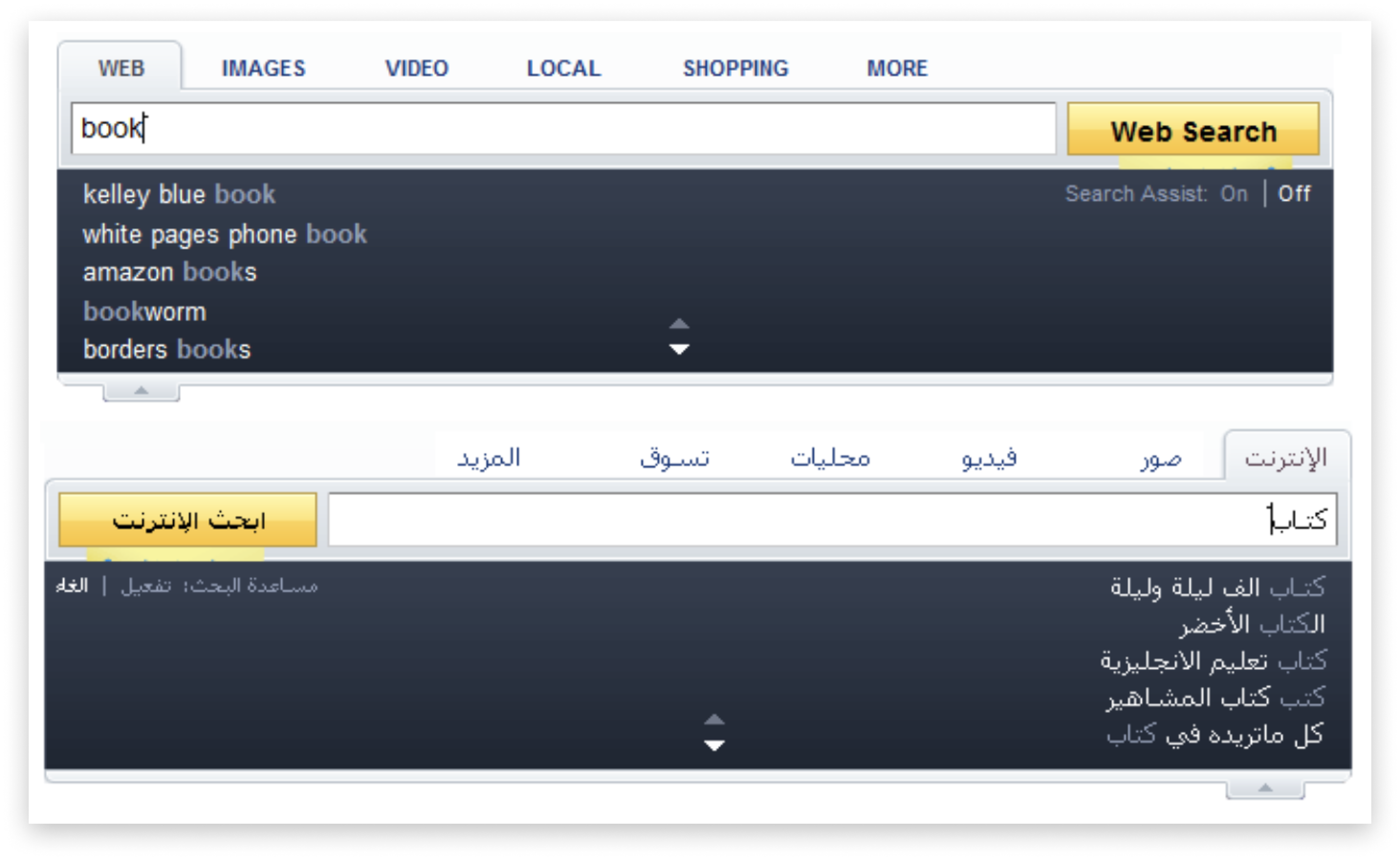
Portal RTL rollout: Yahoo! Mail Arabic
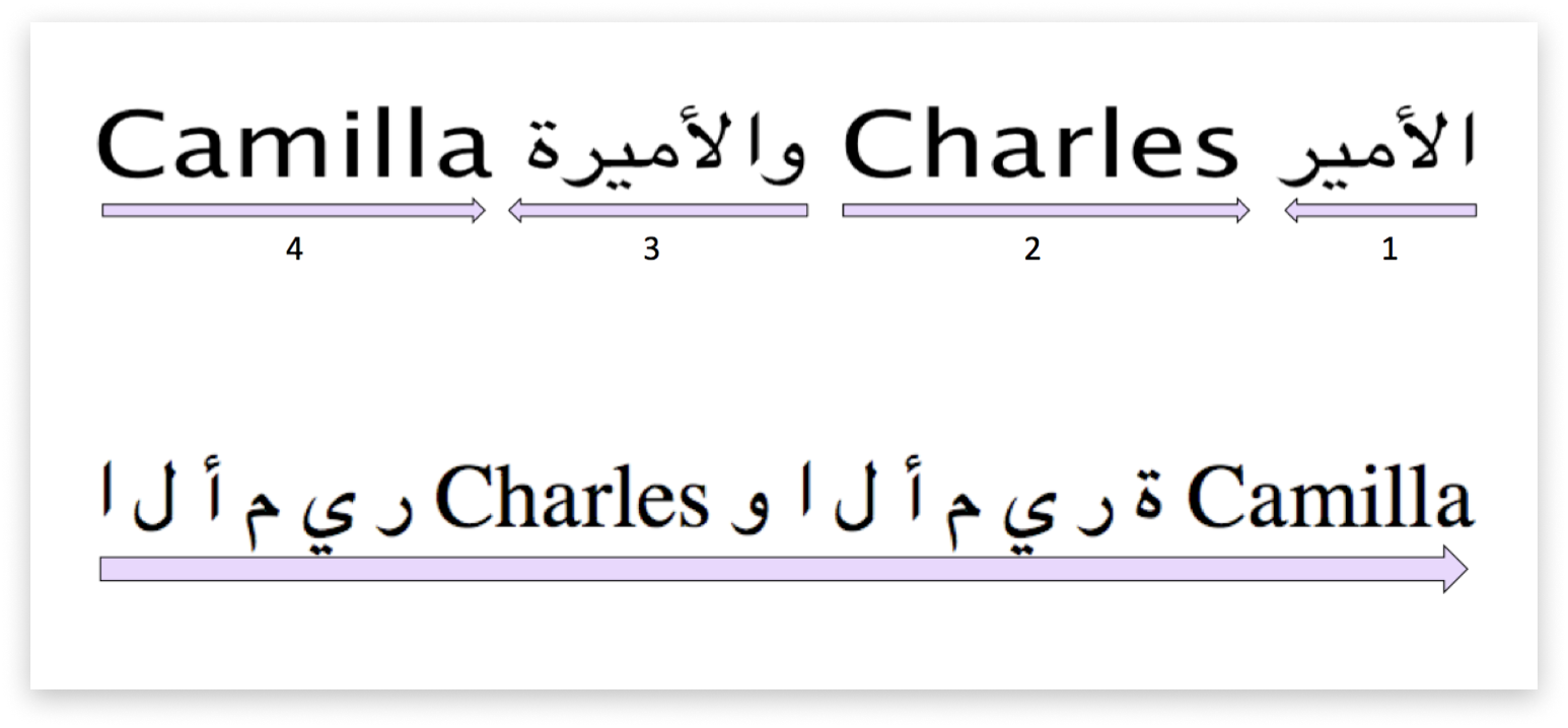
Portal RTL rollout: Yahoo! Finance Hebrew
- Expanded full RTL support to hundreds of millions of Arabic and Hebrew users across 7 Yahoo! portals
- 60% reduction in translation overhead through localization automation tooling
- BiDi Center of Excellence became a durable internal resource, still referenced years after the initial rollout
- RTL component specifications became a required part of the Yahoo! design system contribution process
Yahoo! Mail Accessibility
When I inherited the Yahoo! Mail accessibility audit findings, the headline number was stark: 68% WCAG 2.1 compliance across the primary mail web application. For a product used by hundreds of millions of people, that number represented millions of users who couldn't access core functionality with assistive technology: screen readers that couldn't navigate the folder tree, keyboard users who lost focus context mid-flow, and low-vision users getting insufficient contrast on interactive elements.
This was not a checkbox project. I treated accessibility as a quality dimension, the same standard we'd hold for visual design or performance, and drove it through the organization as such.
Research Approach
I paired automated tooling (axe, WAVE, Lighthouse) with structured usability testing sessions with actual assistive technology users: screen reader users navigating with NVDA and VoiceOver, keyboard-only users completing core email tasks, and participants using high-contrast display modes. The automated tools found the obvious violations; the user testing found the painful ones.
Accessibility audit overview
Focus management redesign
ARIA landmark structure
Challenge
- 68% WCAG 2.1 compliance, well below acceptable threshold for a mass-market product
- Focus management broken across modal dialogs, compose window, and folder navigation
- Missing ARIA labels on icon-only buttons throughout the toolbar
- Keyboard navigation traps in the message list and compose flow
- Color contrast failures on secondary text elements and disabled states
Solution
- Rebuilt focus management: Redesigned the focus flow for all modal interactions, restoring logical focus order and proper return-focus behavior on dismiss.
- ARIA labeling system: Created a systematic ARIA labeling library for all iconographic and non-text interactive elements.
- Keyboard navigation redesign: Defined keyboard shortcuts and tab order specifications for all major Mail workflows, documented in the design system.
- Color system update: Updated color tokens to meet WCAG AA minimum contrast ratios, working with the design system team to implement changes globally.
- Accessibility design guidelines: Authored the Yahoo! Mail Accessibility Design Standards, adopted across the Mail design team for all future work.
- WCAG 2.1 compliance raised from 68% to 96% across Yahoo! Mail primary surfaces
- Zero critical keyboard accessibility blockers in post-audit re-test
- Accessibility standards adopted into the Yahoo! Mail design system, ensuring future features shipped accessible by default
- Positive feedback from screen reader user test cohort: the first time some participants could complete core mail tasks unassisted
Yahoo! Mail Layout & Themes
Yahoo! Mail's navigation had grown organically over many years. Features were added, folders multiplied, and the left-rail navigation that once felt spacious had become a dense, overwhelming list. User research confirmed what the data hinted at: 30% of users reported getting lost in the navigation when trying to access non-inbox mail folders. And the theme system, meant to give users a sense of ownership over their inbox experience, was limited, outdated, and rarely used.
Challenge
- 30% of users reported difficulty navigating to non-inbox folders
- Navigation structure mixed system folders, user-created folders, and secondary features without clear hierarchy
- Theme selection was buried in settings, and theme options were visually dated
- No dark mode support, an increasingly standard user expectation
- High-contrast theme for accessibility was not available at all
Research
I ran a combination of tree testing (to diagnose the IA issues), card sorting (to understand how users mentally organized their mail features), and a preferences survey on theming (to understand which visual environments users actually wanted). The tree testing confirmed the problem: success rates for navigating to non-inbox destinations dropped below 50% for folders three or more levels deep.
Solution
- Simplified navigation architecture: Reduced the primary navigation to five top-level items, with smart folder grouping and a progressive disclosure pattern for deep folder trees.
- Pinned favorites: Allowed users to pin up to five frequently accessed folders to the top of the navigation for one-tap access.
- Themes redesign: Launched a new theme system with Light, Dark, and High Contrast as first-class options, plus a curated collection of seasonal and lifestyle background themes.
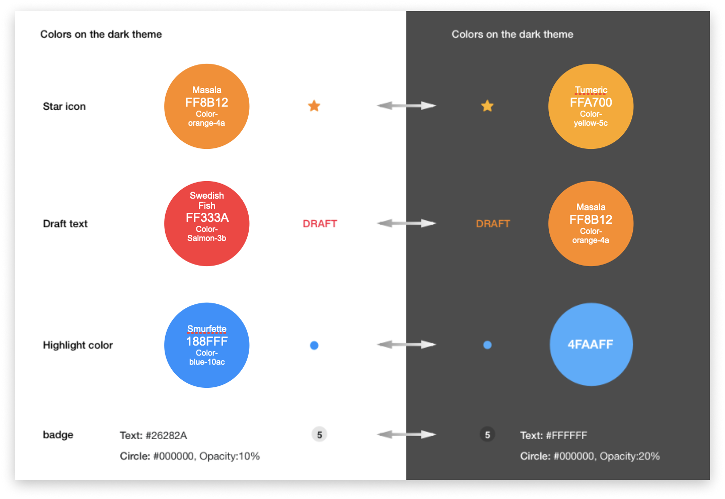
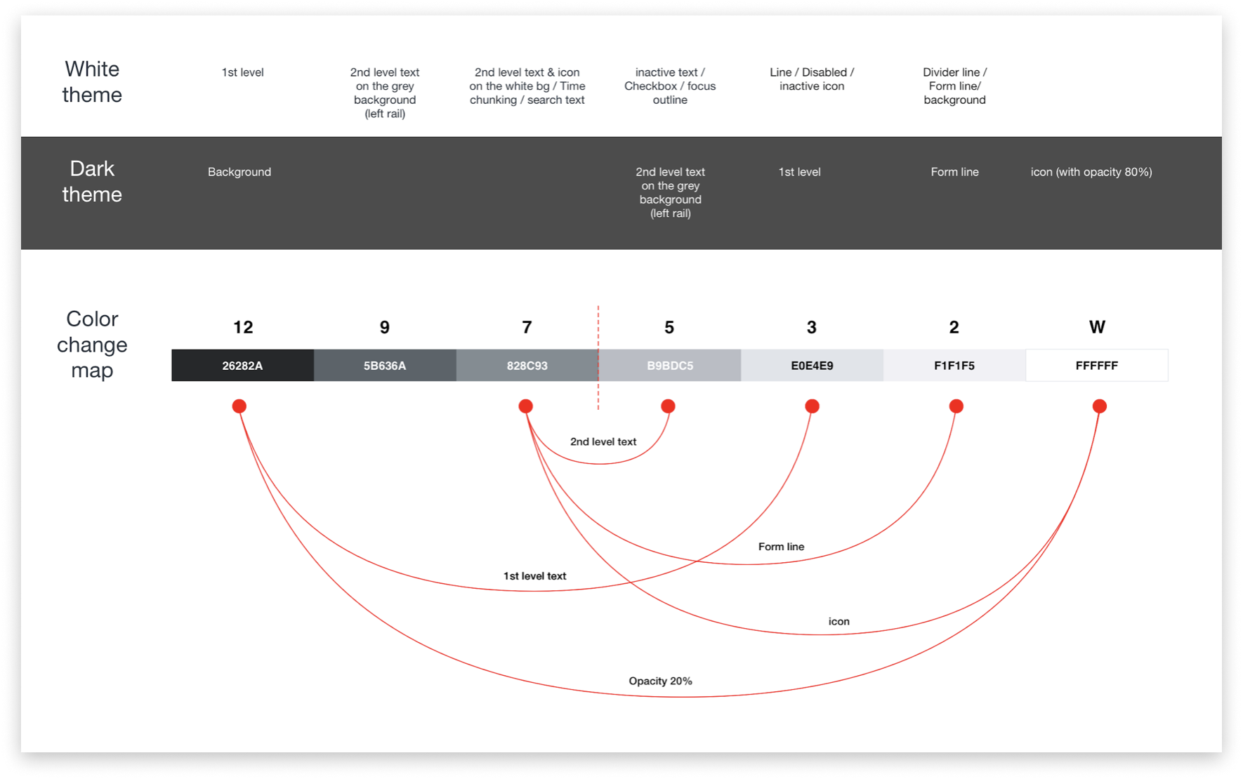
- Dark mode: Designed and documented a complete dark mode token set, ensuring consistent dark treatment across all Mail surfaces.
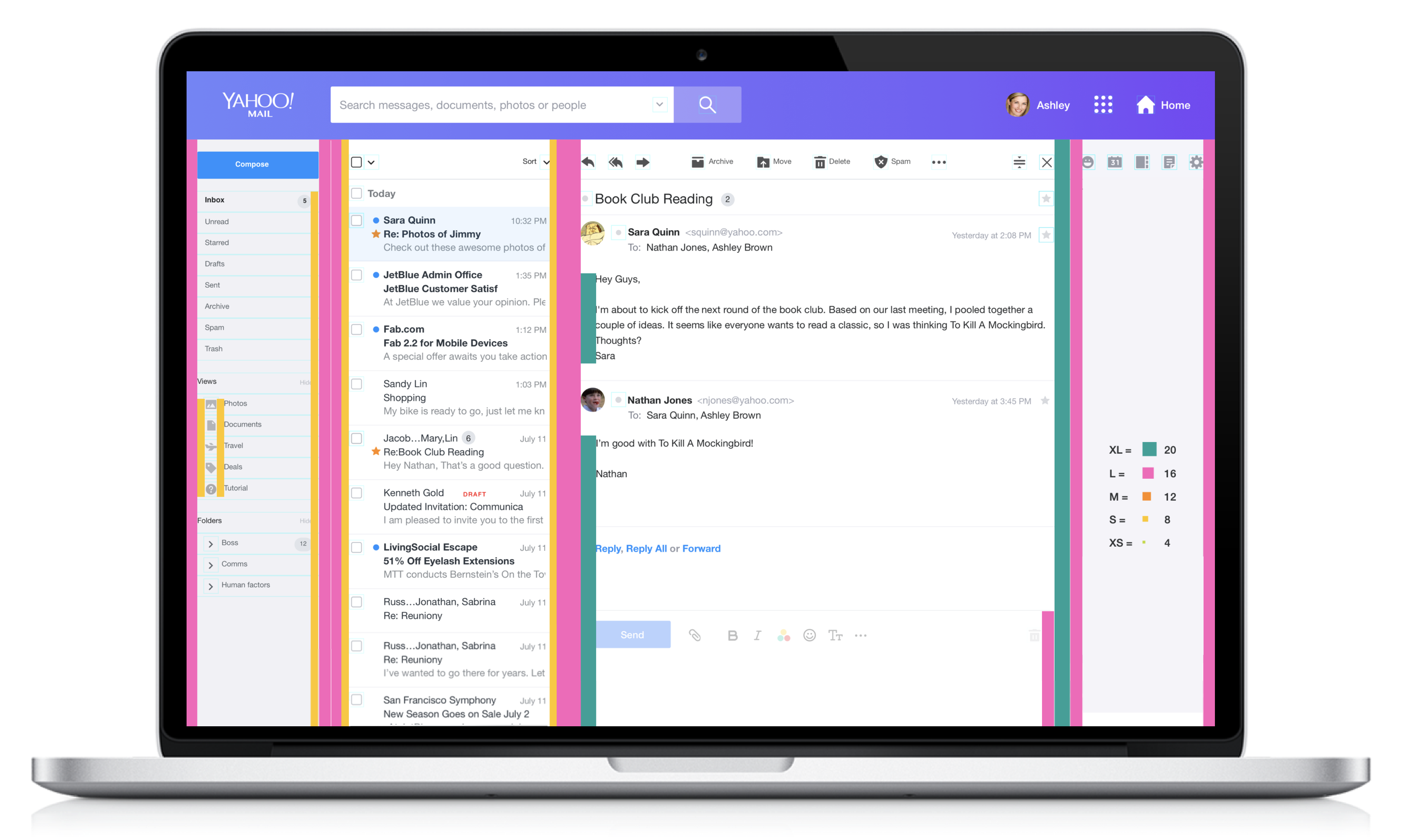
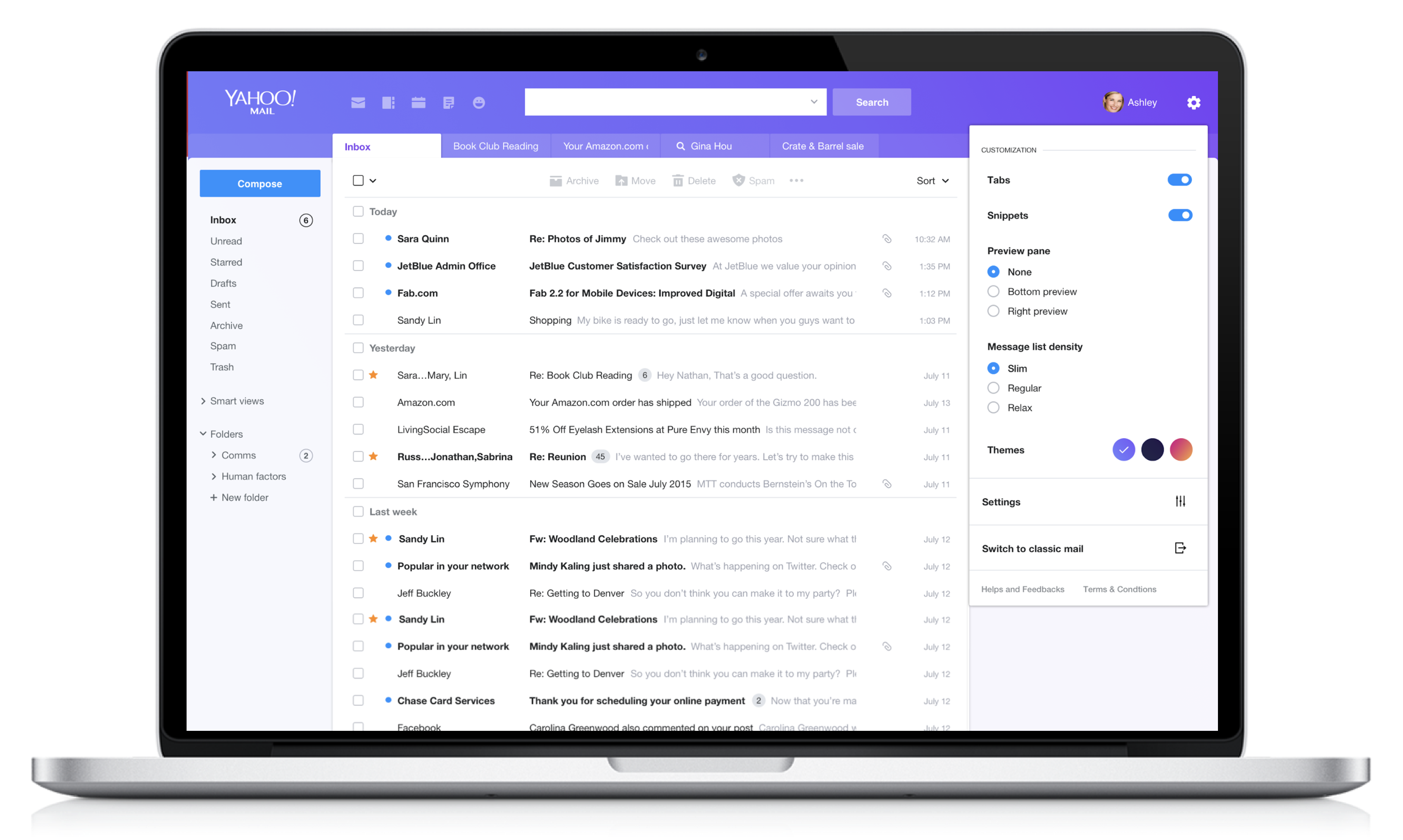
Redesigned Mail navigation: simplified hierarchy
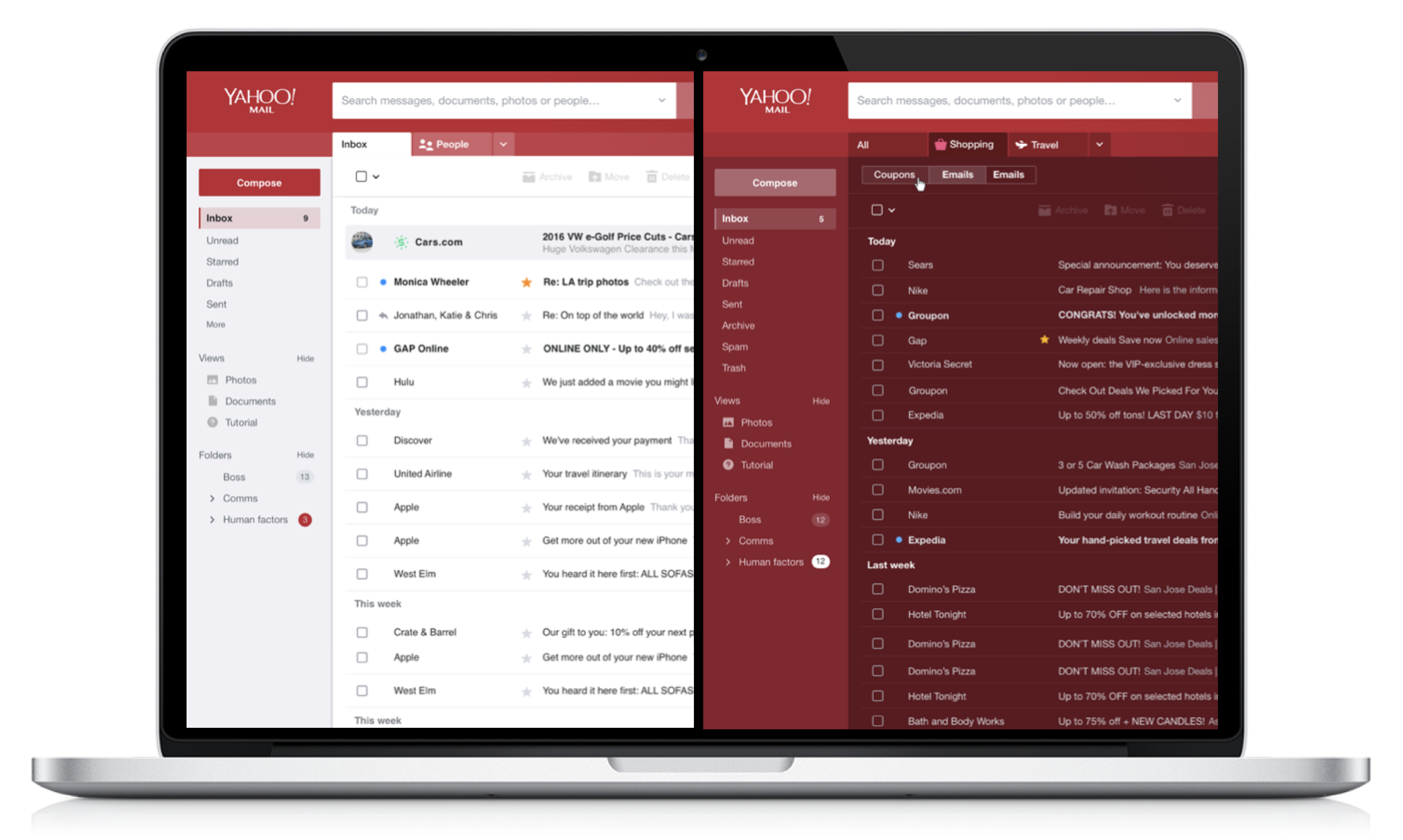
New theme system: selection interface
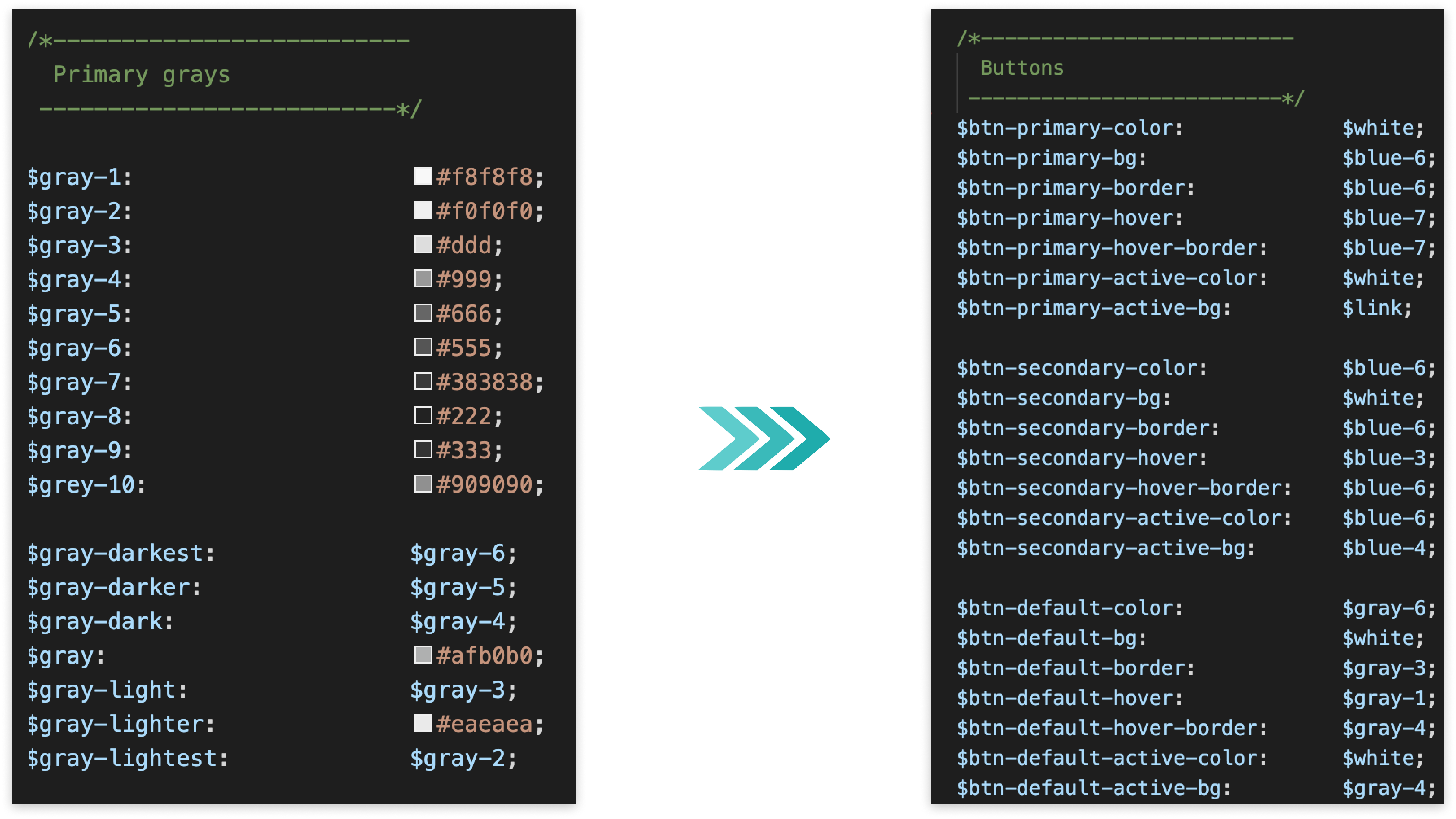
Theme center redesign
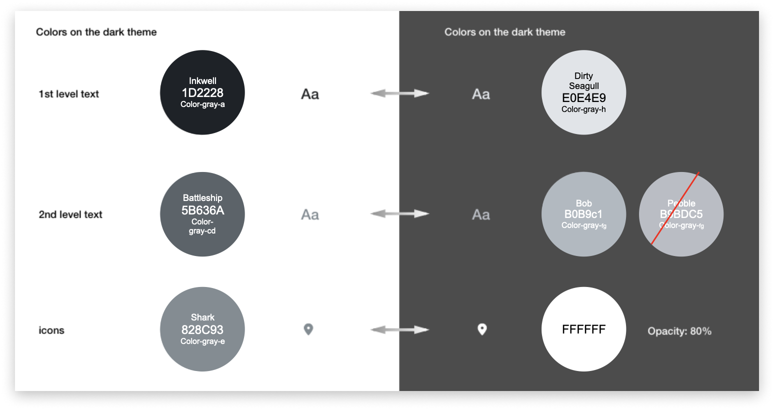
Dark mode: inbox view
Dark mode: compose view
High-contrast mode: full inbox view
- 30% improvement in navigation task completion efficiency in A/B test
- 20% reduction in bounce rate from the inbox view
- Dark mode adoption exceeded projections: 38% of users switched within the first month
- High-contrast mode provided a meaningful accessibility improvement for low-vision users
eBay HR Intranet
eBay's HR ecosystem had grown through acquisitions, policy cycles, and point solutions - resulting in a fragmented intranet where employees were navigating three separate portals to complete what should have been a single workflow. Hiring managers ran open requisitions in one system, new hires completed onboarding paperwork in another, and benefits enrollment lived in a third. I led the end-to-end UX redesign of eBay's HR intranet, unifying hiring, onboarding, and benefits management into a single intelligent platform serving 15,000+ employees across 30+ global offices.
Challenge
- Three disconnected portals for hiring, onboarding, and benefits - no unified employee experience
- New hire onboarding averaged 3.2 days to complete due to portal fragmentation and unclear task sequencing
- HR support ticket volume was 40% higher than industry benchmark; most tickets were navigation and access issues, not policy questions
- No role-aware personalization: a new hire, a hiring manager, and a 10-year employee saw the same undifferentiated homepage
- Benefits eligibility was buried in PDFs; employees frequently enrolled in plans they weren't eligible for, creating downstream administrative overhead
Research Approach
I ran a three-phase discovery: a structured diary study with 12 new hires documenting their first 30 days, contextual inquiry sessions with 8 HR business partners tracking how they used the existing tools, and a survey of 200 hiring managers on their open-requisition workflow pain points. The diary study was particularly revealing: new hire confusion peaked at days 3-5, precisely when they had to cross from the onboarding portal into benefits enrollment - a transition that had no guidance and a completely different visual system.
Information architecture: three portals unified into one
Role-personalized onboarding tracker: Day 1-30 task flow
What I Built
- Role-aware personalization engine: Designed a context layer that surfaced different homepage experiences for new hires (onboarding checklist + progress tracker), hiring managers (open requisitions + candidate pipeline status), and established employees (benefits hub + HR resources). Same URL, radically different experience.
- Onboarding journey: Step-by-step progress tracker guiding new hires through day 1-30 tasks in a single sequenced flow - eliminating the portal-hopping that was causing drop-off. Each task step linked directly to the action, not to the portal homepage.
- Eligibility-aware benefits hub: Replaced the static benefits PDF library with a dynamic display that showed each employee only the plans, options, and open enrollment windows that applied to their role, location, and employment type.
- Manager hiring dashboard: Consolidated open requisitions, candidate pipeline by stage, and pending approvals into a single view - designed for a hiring manager who spends 15 minutes per day on recruiting, not a full-time recruiter.
- HR knowledge base: Restructured the HR policy library around job-to-be-done taxonomy (leave, pay, development, performance) rather than the org chart structure that had made it nearly impossible to find anything.
Manager view: requisitions, pipeline, and pending approvals
Benefits hub: personalized enrollment showing only eligible plans
- New hire onboarding completion time reduced by 45% - from 3.2 days to under 1.8 days on average
- HR support ticket volume down 35%, with portal navigation and access tickets nearly eliminated
- Employee satisfaction with HR tools improved from 2.9 to 4.3 out of 5 in post-launch internal survey
- Benefits enrollment errors reduced by 60%; eligibility-aware display eliminated the most common mis-enrollment patterns
- Hiring manager task completion rate for requisition management improved from 61% to 89% in usability testing
- Platform adopted company-wide across 15,000+ employees in 30+ global offices within 8 weeks of launch
eBay Split Payment
eBay's checkout flow had a structural ceiling problem: buyers purchasing high-value items - collectibles, electronics, rare finds - frequently abandoned checkout when their preferred payment method couldn't cover the full amount. A partial gift card balance. A credit line that fell just short. A rewards balance they wanted to apply. The platform had no mechanism for combining payment methods, and checkout data showed abandonment rates climbing sharply for orders above $500. I led the UX design of split payment across web, iOS, and Android - enabling buyers to divide purchases across up to two payment methods and bridging the gap between what buyers had and what they wanted to spend.
Challenge
- Checkout abandonment 23% higher than category average for orders above $500 - payment method limitation was the primary exit reason per exit survey data
- No mechanism to combine payment methods; buyers with partial gift card balances, store credit, or split-eligible payment accounts had no path to completion
- High complexity: fraud, payment processing, partial authorization failures, and refund logic all required careful design of edge-case states
- Three surfaces to design simultaneously - web checkout and native iOS/Android flows - each with different layout constraints and interaction patterns
- Real-money error states: a failed partial payment on a $800 transaction required crystal-clear recovery UX or buyers would lose trust in the checkout entirely
Research & Discovery
I ran jobs-to-be-done interviews with 18 buyers who had abandoned high-value eBay purchases in the prior 90 days. The clearest pattern: buyers weren't leaving because they didn't want the item - they left because the checkout made it impossible to pay the way they'd planned. Gift card + card was the most-cited desired split. I also ran a preference study on how buyers wanted to see the split visualized in real time, testing four balance-display patterns before landing on a live "remaining balance" model that tested with the highest confidence scores.
Mobile checkout: split payment method selection
Real-time remaining balance as payment methods are added
Partial authorization failure: clear recovery path with trust-preserving messaging
What I Built
- Two-method payment flow: Buyers can designate a primary payment method (applied first, up to available balance) and a secondary method (applied to the remainder). The flow works for gift card + card, eBay Bucks + card, store credit + PayPal, and other eligible combinations.
- Live balance visualization: A real-time remaining balance display updates as each payment method is selected - showing exactly how much is covered, how much remains, and which method will cover the difference. Tested with the highest trust rating of four visualization approaches.
- Cross-platform design system: Designed a single interaction model that translated faithfully to web, iOS, and Android with appropriate platform-native affordances on each. Web used an inline expandable payment section; mobile used a bottom-sheet payment selector with haptic confirmation on successful split.
- Error state system: Designed 12 distinct error and edge-case states for partial payment failures - partial authorization declined, insufficient secondary balance, payment method not eligible for split - each with a specific, trust-preserving message and a clear recovery action. No generic error messages.
- Refund transparency: Designed a post-purchase receipt pattern that clearly shows how a refund would be apportioned back to each payment method - a detail that had caused significant buyer confusion in competitive analysis of other split-payment implementations.
Web checkout: inline split payment with live remaining balance
Order confirmation: refund apportionment shown per payment method
- Checkout abandonment reduced by 18% for orders above $500 - the primary target segment for the feature
- 12% of eligible transactions used split payment within the first 6 months of launch
- Average order value increased by 8% on transactions that used the split payment flow
- Feature shipped simultaneously on web, iOS, and Android within 2 sprint cycles from final design handoff
- Post-launch buyer trust score (custom survey) for checkout remained stable - no regression from the added complexity of a two-method flow
- 12 error states designed and shipped; post-launch support contacts related to split payment failures came in below the pre-launch estimate by 40%